RecallMax
A case study about optimizing dental office workflows through automation and intuitive product design.

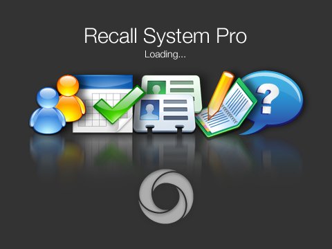
At the time of this project, RecallMax was transitioning from the name Recall System Solutions to Recall System Pro. As such, all three of these names will be used interchangeably throughout this case study
Project Overview
Role: Lead UX/UI Designer
Team: Worked closely with founders, developers and stakeholders
Tools: Photoshop, Illustrator, Whiteboards (Figma did not exist yet)
Duration: 18 months
Methods: User research, usability testing, iterative design
Problem: The need for an easy-to-use system for dental staff to manage administrative tasks, optimize their schedule to maximize business profitability, and improve dental health care outcomes.
Research and Definitions
Summary: User research included interviews with dental staff, revealing that most struggled with time-consuming scheduling processes.
Details: Our research goals were to empathize with users, to understand user pain points and identify key features.
Through interviews and observations, we gained insights into the different roles within dental practices:
Dental receptionists are proficient in their roles, keen on optimizing business operations by reducing repetitive administrative tasks and focusing on patient follow-up.
Dentists prefer to focus on patient care and often lack the time or expertise to manage business operations effectively.
Hygienists value workplaces that are organized and consistently booked, as their income depends on patient visits.
Dental practices often rely on outdated software and poorly organized physical records, leading to inefficiencies and operational challenges.


Ideation
Given that RecallMax was a startup led by non-technical founders, working with medium-fidelity mockups proved to be more effective than traditional wireframes. Medium-fidelity mockups provided a clearer representation of the application's look and functionality, making it easier for stakeholders to grasp the design concepts and offer meaningful input.
By incorporating some visual detail while still maintaining flexibility for changes, these mockups facilitated productive discussions and allowed us to iterate quickly.
I created various flats to explore different user flows and interface elements. For instance, I experimented with configurations for task lists, displaying scenarios such as individual scroll bars for expanded task groups and an "expand-all" view. These mockups helped visualize interactions like task management, patient follow-ups, and appointment handling, ensuring key functionalities were thoughtfully integrated into the design.
This ideation approach laid a solid foundation for moving into the prototyping phase, where the designs would be further refined with more interactivity and user flows before being tested for usability.

Prototyping
During the prototyping phase, the concepts we had conceived began to take shape as interactive elements and workflows. We focused on bringing key functionalities to life, with some of the most exciting developments centered around the dashboards we created. These dashboards provided dental practices with crucial insights into the health of their operations through key performance metrics, such as appointment completion rates, patient retention, and revenue trends.


Interactive prototypes allowed us to simulate real-world usage scenarios and refine the user experience by testing various data visualizations and user flows. This helped ensure the design not only met user needs but also provided intuitive ways to track and act on the most important metrics for their practice. As we iterated, the prototypes became more polished, setting a solid foundation for usability testing in the subsequent phase.


Final Design
The final solution featured an integrated dock-style app that facilitated seamless navigation without switching between different software.
Why This Solution: It minimized training needs and reduced administrative burden.
Alternative Considerations: Explored but discarded complex navigation structures.
6. Impact
RecallMax improved practice efficiency, with an 18% reduction in appointment cancellations and a 25% increase in patient retention. User feedback highlighted ease of use as a significant factor.
Learnings
This project underscored the value of early and continuous user feedback. I learned the importance of balancing user needs with business goals and gained insights into designing for healthcare environments.
